Designing for Accessibility
Building scalable accessibility standards for Renault's authorised dealership websites.
- Role
- UI/UX Designer
- Year
- 2024
- Status
- Applied to renewturkiye.com/yetkili-saticilar
This project focused on improving accessibility across Renault Türkiye's authorised dealership websites.
ABC Renault was one of the dealership websites used during the audit, but the objective wasn't to improve a single website. The goal was to define accessibility standards that could be applied consistently across the entire dealership network.
Using the WCAG 2.1 guidelines as a framework, I evaluated the existing experience, identified accessibility issues and prepared practical recommendations for the development team.
01
Why it mattered
For many customers, dealership websites are their first interaction with the brand.
They browse vehicles, explore campaigns, find dealership information and learn about after-sales services through these websites.
I believe these experiences should be accessible to everyone.
For me, accessibility isn't simply about meeting standards. It's about making digital products usable by as many people as possible.
02
The audit process
The audit was based on the four WCAG 2.1 principles:
- Perceivable
- Operable
- Understandable
- Robust
I combined automated accessibility testing with manual evaluation.
Beyond tools such as Axe DevTools and WAVE, I tested key user journeys using keyboard-only navigation and screen readers including NVDA and VoiceOver.
This helped reveal not only technical issues but also real usability problems experienced by people using assistive technologies.
03
Key findings
Several recurring accessibility issues appeared throughout the websites.
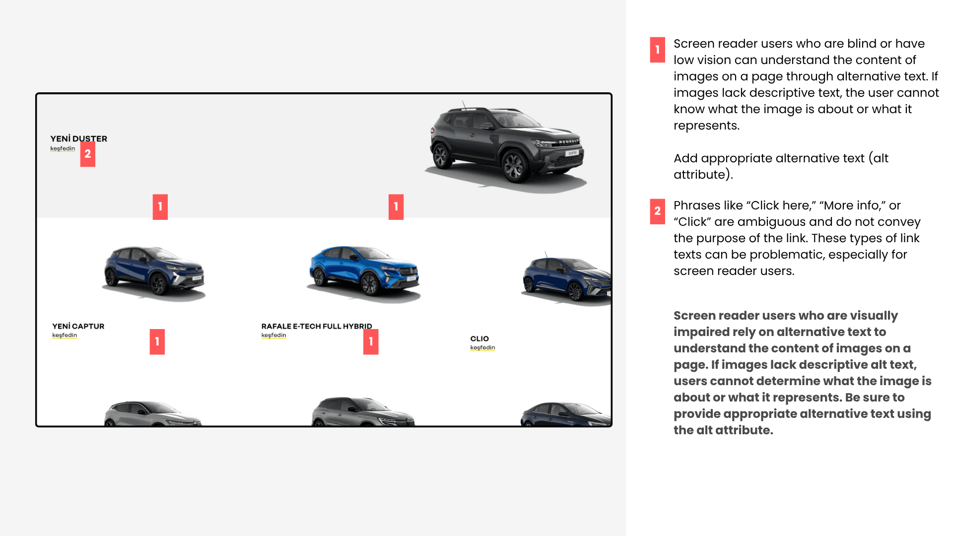
Heading structures were inconsistent, making page hierarchy difficult for screen readers to interpret.
Some visually formatted lists lacked proper semantic markup.
Dropdown menus didn't communicate their expanded state correctly.
Several colour combinations failed minimum contrast requirements.
Forms also lacked clear labels and guidance, making data entry more difficult than necessary.
04
The biggest challenge
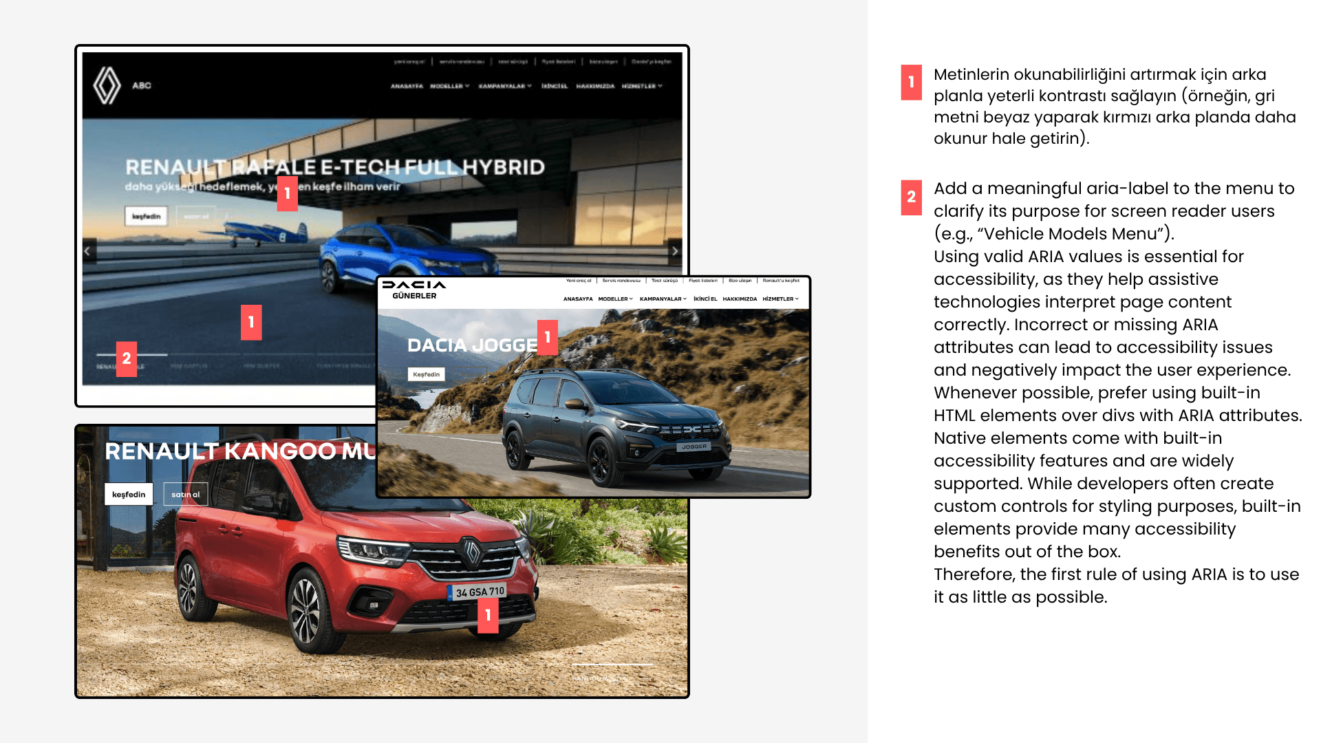
The homepage hero carousel presented the most significant accessibility issue.
Because slides changed automatically, screen reader users could easily lose context.
I proposed improvements including:
- Fully keyboard-accessible navigation
- Proper ARIA implementation
- Live announcements for changing content
- Better focus management
On mobile, I also reviewed reading order rather than visual layout alone.
Several pages looked correct visually but were announced in the wrong sequence by screen readers, highlighting how important semantic structure is for an accessible experience.
05
Outcome
The project resulted in a scalable set of accessibility recommendations that could be applied across Renault's dealership websites rather than a single implementation.
More importantly, it reinforced that accessibility should never be treated as a final checklist.
It should be considered from the beginning as an essential part of creating inclusive digital experiences.
06
What I learned
This project reinforced an important lesson for me.
Accessibility is not about compliance alone.
Small semantic decisions can determine whether someone is able to use a product at all.
Great design isn't only visually appealing — it enables as many people as possible to successfully use the product.
Next
BikadroA marketplace connecting travelling photographers with local photography experiences.
More about my design philosophy →