Port Wallet
Designing a safer, clearer digital wallet experience
- Role
- UI/UX Designer
- Year
- 2024–2025
- Status
- Live
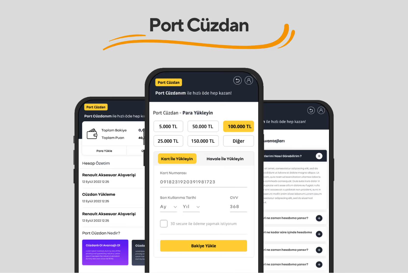
Port Wallet was designed as a payment experience within the Renault and Dacia ecosystem, bringing accessory purchases and fuel payments together in a single digital wallet.
The most challenging part of the product wasn't the wallet itself. It was the identity verification journey users had to complete before they could use the wallet with real money.
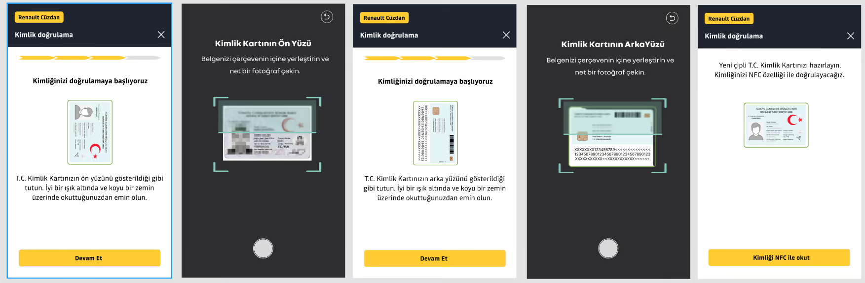
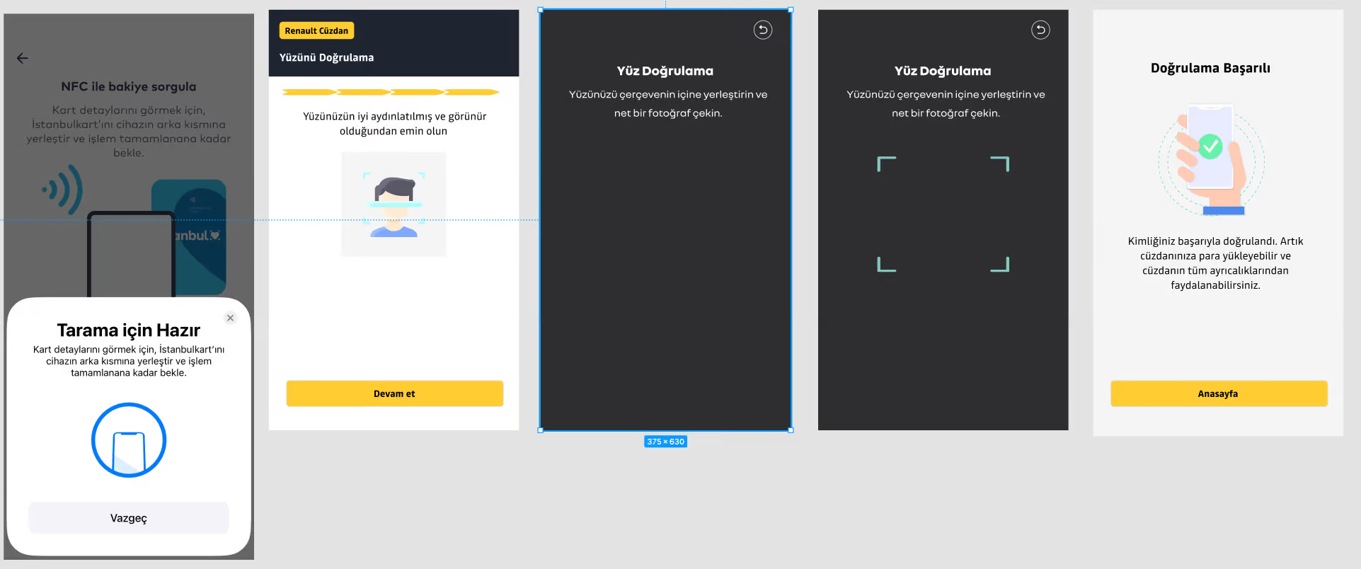
The KYC process included several steps: identity document scanning, NFC verification, face verification and address verification. Each step could also fail for a different reason.
The question I kept coming back to was:
How can we help users when things don't go as planned?
01
Understanding the problem
During identity verification, users could get stuck because of poor lighting, glare on an identity document, a device without NFC support or a lost connection.
An identity document might not scan correctly. An NFC connection might fail. Face verification might not work as expected.
The problem wasn't simply that verification could fail.
The bigger problem was that users might not understand why it failed or what they were supposed to do next.
Rather than hiding the complexity of the KYC process, the goal was to make it clearer and more predictable.
02Design approach
Designing for failure, not just success
I didn't approach identity verification only through the ideal happy path.
For every step, I also asked:
What happens when something goes wrong?
When a document had glare, NFC couldn't be read, face verification failed or the connection dropped, the experience needed to explain:
- what happened
- why it happened, when possible
- what the user could do next
Instead of technical or blaming error messages, I used calm and actionable microcopy.
Rather than simply telling users "Verification failed," the experience explains the problem and gives them a clear way to try again.
03
The KYC journey
The verification journey follows five main steps:
Identity document
Preparing and scanning the identity document.
NFC
Reading the identity document through NFC.
Face verification
Verifying the user's face.
Address
Verifying address information.
Confirmation
Completing the identity verification process.
Setting expectations from the beginning was an important part of the experience.
Users could see how many steps were ahead and understand what was coming next, making the process feel more predictable rather than surprising.
04
Payment experience
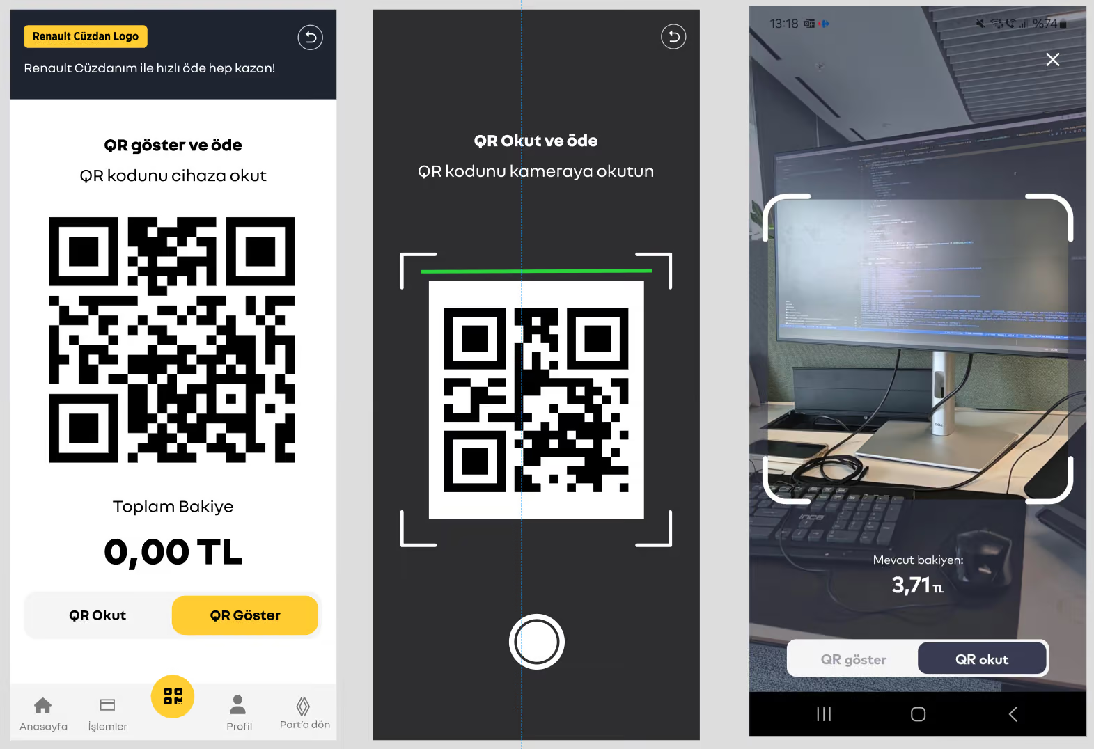
Unlike the identity verification flow, the payment experience was intentionally kept simple.
For fast checkout, the experience uses a short-lived dynamic QR code. If the QR code can't be scanned, users can continue with a manual code instead.
This matters because payment often happens at a checkout counter, where people are under time pressure.
The principle was simple:
Payment should be fast, but there should always be a second way forward when something goes wrong.
05
Designing the wallet for everyday use
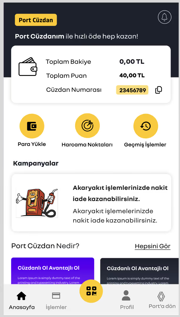
Port Wallet was designed to be more than a payment tool.
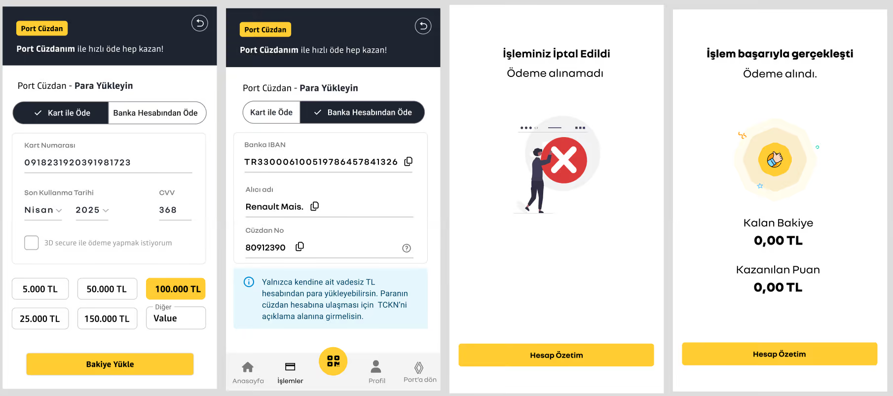
Users can add money using a card or bank account, track their transactions, and transfer balance to another Port Wallet user or a bank account.
They can also discover nearby businesses where Port Wallet is accepted and access a digital receipt for each transaction.
Transaction history is accessible directly from the home screen, making it easy to understand where and how money has been spent.
06
Security and trust
Because Port Wallet is a payment product, trust was an important part of the experience.
Card information remained masked throughout the journey, while 3D Secure support and inline validation helped reinforce the security of the payment experience.
The goal wasn't only to build a secure system, but to present that security through an experience that felt clear and trustworthy to users.
07
Design system
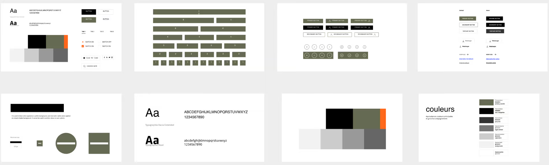
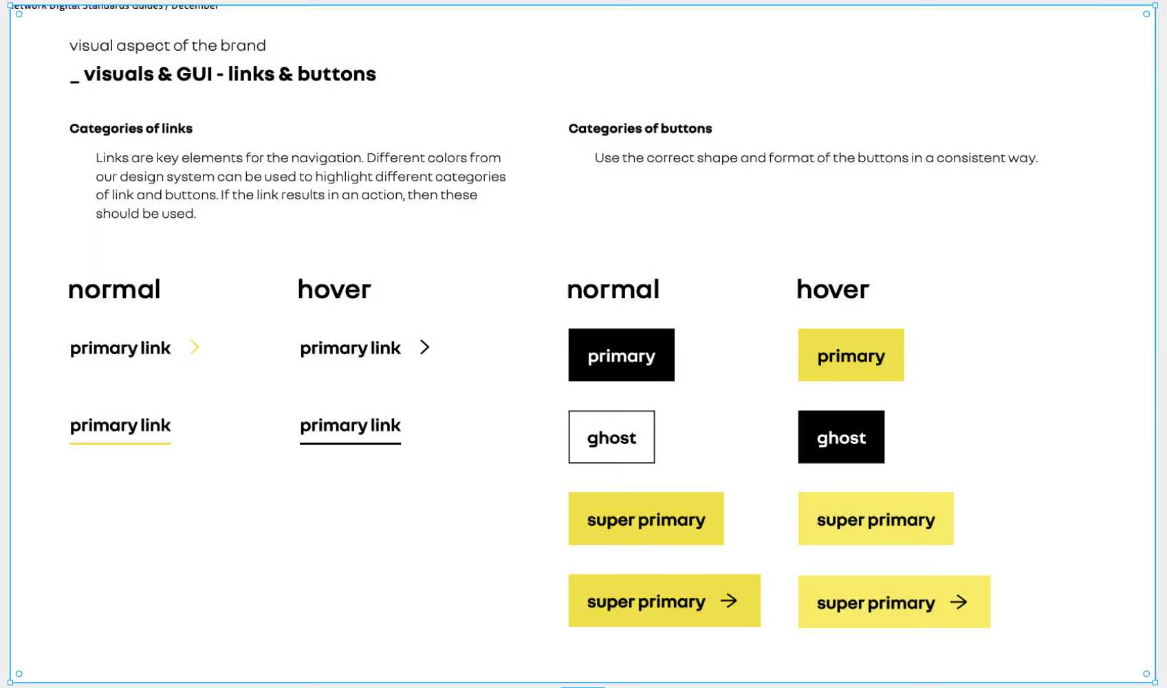
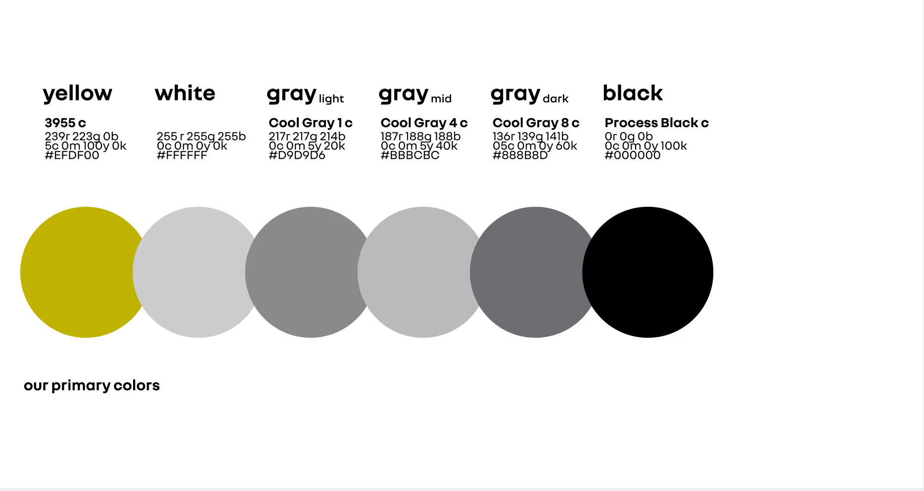
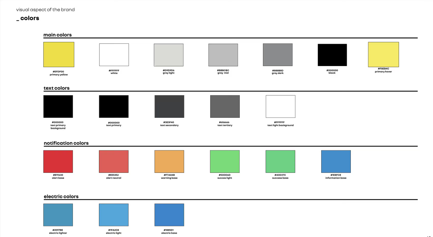
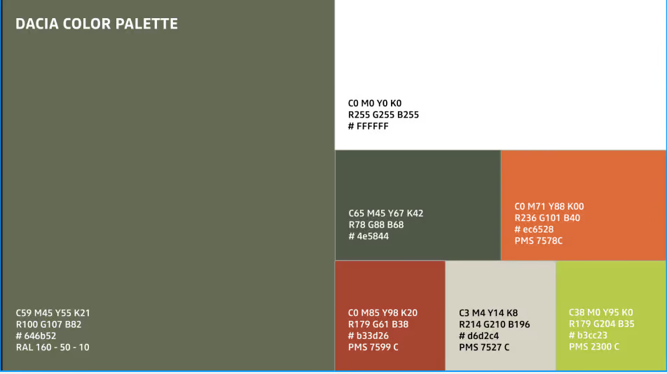
Port Wallet was built on top of Renault and Dacia's corporate design system.
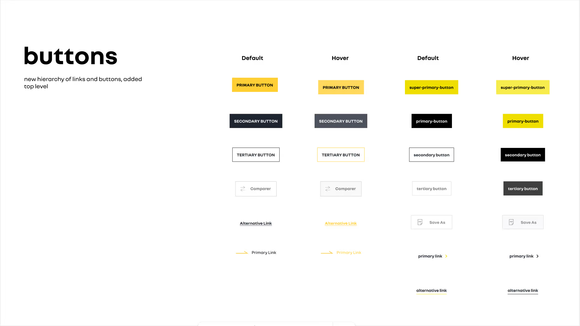
Shared foundations — color palette, typography and button hierarchy — helped the wallet stay visually consistent and predictable within the wider brand ecosystem.
08
Outcome
With Port Wallet, the goal wasn't to make the KYC process look simpler than it actually was.
The goal was to make it predictable.
We focused on turning a complex, regulated and failure-prone process into an experience where users could understand what to do at every stage.
Designing for failure also helped make operational issues more understandable. Instead of unexplained verification problems, clearer states could be defined for different types of missing or invalid information, making them easier to follow and resolve.
09
What I learned
One of my biggest takeaways from this project was that simplifying a complex product doesn't always mean reducing the number of steps.
Sometimes, the biggest difference comes from making sure users understand what is happening at every stage — and what they can do next.
Especially in products where trust is critical, such as payments and identity verification, designing for what happens when things go wrong is just as important as designing the successful path.
Next
Renault PortA mobile experience that brings every stage of vehicle ownership into one place.
More about my design philosophy →