Renew Platform - User Experience - Focused Design Processes
Renew is a digital platform focused on the pre-owned vehicle market, backed by Renault. It enables users to manage purchasing and selling, financing, comparison, and valuation quickly and transparently. With a simple interface and guided steps, it delivers a seamless experience for every user profile.
Key Focus Areas Vehicle Comparison: We restructured the comparison module to enable users to clearly compare vehicle features. Vehicle Valuation: We simplified and made more guided the flow that lets users enter their own vehicle and receive an estimated value.
Key Focus Areas Vehicle Comparison: We restructured the comparison module to enable users to clearly compare vehicle features. Vehicle Valuation: We simplified and made more guided the flow that lets users enter their own vehicle and receive an estimated value.

Vehicle Valuation - Renew Platform
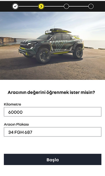
Renew offers a Vehicle Valuation flow that lets users learn the estimated value of their pre-owned car. This flow is critical both as a lead-generation mechanism for the brand and as a tool that shapes users’ price expectations. This case study details how we examined, simplified, and improved the flow from both UI and UX perspectives.
Problem Definition
The flow had too many steps, and users couldn’t clearly see where they were in the process. In several steps, the meaning or requirement status of input fields was unclear. We first simplified the flow from 10 steps to 3. Later, based on needs, we integrated damage assessment and accessory details, bringing the total to 5 steps. The new structure is more fluid, explanatory, and controlled.
Goals
-
Clarify the purpose and contribution of each step
-
Create a smoother, more guided micro-flow
-
Simplify input fields and order them more logically
-
Reduce visual density without losing detail
-
Motivate the user to continue post-verification (CTA)
-
Integrate missing damage and equipment information

In 5 Steps: A Smoother, More Guided Micro-Flow
-
Clarify the purpose and contribution of each step
-
Create a smoother, more guided micro-flow
-
Simplify input fields and order them more logically
-
Reduce visual density without losing detail
-
Motivate the user to continue post-verification (CTA)
-
Integrate missing damage and equipment information

RENEW VEHICLE COMPARISON
Define the User Need
Polished alternative:
-
Users compare multiple vehicles during browsing.
-
The UI should always clarify:
-
The action to enter the comparison view
-
Pain Points in the Current Experience
-
The visual treatment of selected vehicles is weak, so users can’t quickly tell which ones they’ve chosen.
-
Empty slots aren’t directive enough; they don’t nudge users to “add one more vehicle.”
-
The Compare button could stand out more as a primary CTA.
-
Polished alternative:
-
Selected states lack visual clarity, making it hard to recognize chosen vehicles at a glance.
-
Placeholder/empty areas don’t encourage progression (no clear prompt to add another vehicle).
-
The Compare action needs stronger prominence and affordance as the main call to action.
-


RENEW VEHICLE COMPARISON
New Comparison Page
Selection & Visibility
-
Selected vehicles are clearly displayed with image + model + price.
-
The “Add Vehicle” area is designed to be prominent.
Comparison Bar
-
A bottom bar stays visible at all times, showing clear status like “Compare (2/4)”.
-
The user instantly sees how many vehicles are selected.
-
When 2 or more are selected, the Compare button becomes active.
Why this helps
-
The selection process becomes faster and smoother.
-
Because the comparison action is always visible, it naturally guides the user.
-
The user experiences continuous feedback and guidance, with a strong sense of control during comparison.
-
They can clearly see how many vehicles are selected and how many slots remain. The Compare button is always accessible, so the user never gets lost and can make selections confidently.
RENEW
Result: Faster, Clearer, More Reliable
The redesign on the Renew platform enables users to complete critical tasks—such as vehicle valuation and comparison—in a cleaner, clearer, and more guided structure. By simplifying both visuals and interactions, users now access more information in fewer steps.
Improvements delivered:
-
Reduced complex and tiring steps
-
Clarified the purpose of each step and introduced guided micro-flows
-
Balanced visual density and strengthened information hierarchy
-
Increased the user’s sense of control throughout the journey
Comparison module:
-
Made selected vehicles more visible
-
Made the comparison process more intuitive
-
Elevated CTA areas for clearer next actions
As a result, users can more easily and quickly understand which vehicles they’ve selected, how many more they can add, and how to proceed to comparison.
This work demonstrates how a user-centric, data-driven, and test-informed design approach delivers tangible benefits on multi-functional platforms like Renew.