Port Wallet – A Smart Payment Platform for the Digital Vehicle Experience
Port Wallet is a shopping and services platform that connects Renault and Dacia users to their vehicle’s digital ecosystem. By linking their vehicles to the app, users can purchase accessories from authorized dealers and manage fuel payments through a single digital wallet. The product is designed to strengthen the after-sales experience, simplify transactions, and increase brand loyalty.
In this project, I led the design process end-to-end—from shaping user flows to UI design, prototyping, and development handoff. My focus was on building secure and intuitive payment journeys, maintaining a visual language consistent with the brand, and creating a clear information architecture that guides users confidently at every step.


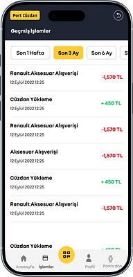
Users can view their balance, top up their wallet, track transaction history, and access exclusive benefits within a single, intuitive flow.
The design focuses on a secure transaction experience, a clear information architecture, and a visual language consistent with the brand identity.
Each screen is supported by micro-guidance elements and a visual hierarchy that clearly communicates what the user is doing at every step.
Identity Verification & Liveness (Face Verification) Experience


What problem did this flow solve?
To ensure secure payments and transactions in Port Wallet, users needed to complete identity verification (ID verification) and face verification/liveness checks. Because of security, regulatory requirements, and fraud prevention, this was a multi-step flow with a high likelihood of errors and drop-offs. My goal was to translate that complexity into an experience that feels clear, trustworthy, and easy to complete—without exposing the underlying complexity to the user.
How did I design the process?
-
I broke the flow into clear steps and set expectations early: I designed a structure that communicates “how many steps are there and what happens next?” through preparation screens, guidance, verification steps, and outcome screens.
-
I made real-world steps (camera/NFC) error-tolerant: For document scanning, NFC reading, and face scanning, I accounted for variables like lighting, focus, connectivity, and permissions—adding clear guidance plus retry and alternative-path scenarios.
-
I reduced user anxiety through UX writing: Security-heavy experiences can feel intimidating. I used calm, explanatory microcopy that clarifies why information is needed, how long it takes, and how data is handled.
-
I designed edge cases as part of the core experience:
-
Document unreadable / glare / cropping issues
-
NFC failed / device not supported
-
Face verification issues (low light, movement, no match)
-
Network errors / delayed service responses
I created dedicated states, error messages, recovery paths, and retry flows for these scenarios.
-
-
Secure, yet brand-consistent visual language: I maintained a UI language aligned with the Renault/Dacia ecosystem while reinforcing trust through consistent states, button hierarchy, iconography, and controlled information density.
-
Prototyping + handoff: I prototyped the flow end-to-end to simulate a real user journey and delivered clear development handoff documentation, defining states and error handling at the component level.
Outcome (strong, without inventing metrics):
This work transformed a critical KYC flow into a guided, low-friction experience that tells users exactly what to do at each step—while making incomplete or invalid verification scenarios more manageable for the operation side.
iWallet — Fast Checkout: Dynamic QR + Payment Code


With this flow, I designed a payment experience that enables fast checkout, strengthens security with a short-lived QR code, and ensures seamless continuation via a manual code when QR scanning fails.
%20(6000%20x%203200%20piksel).png)
Project Outcome
Port Wallet brings together payment, loyalty, and service experiences within a single digital ecosystem for Renault and Dacia users.
The redesigned flows make transactions faster, more transparent, and easier to complete.
Every screen was created to support a clear and consistent experience — one that feels simple, trustworthy, and aligned with the brand’s identity